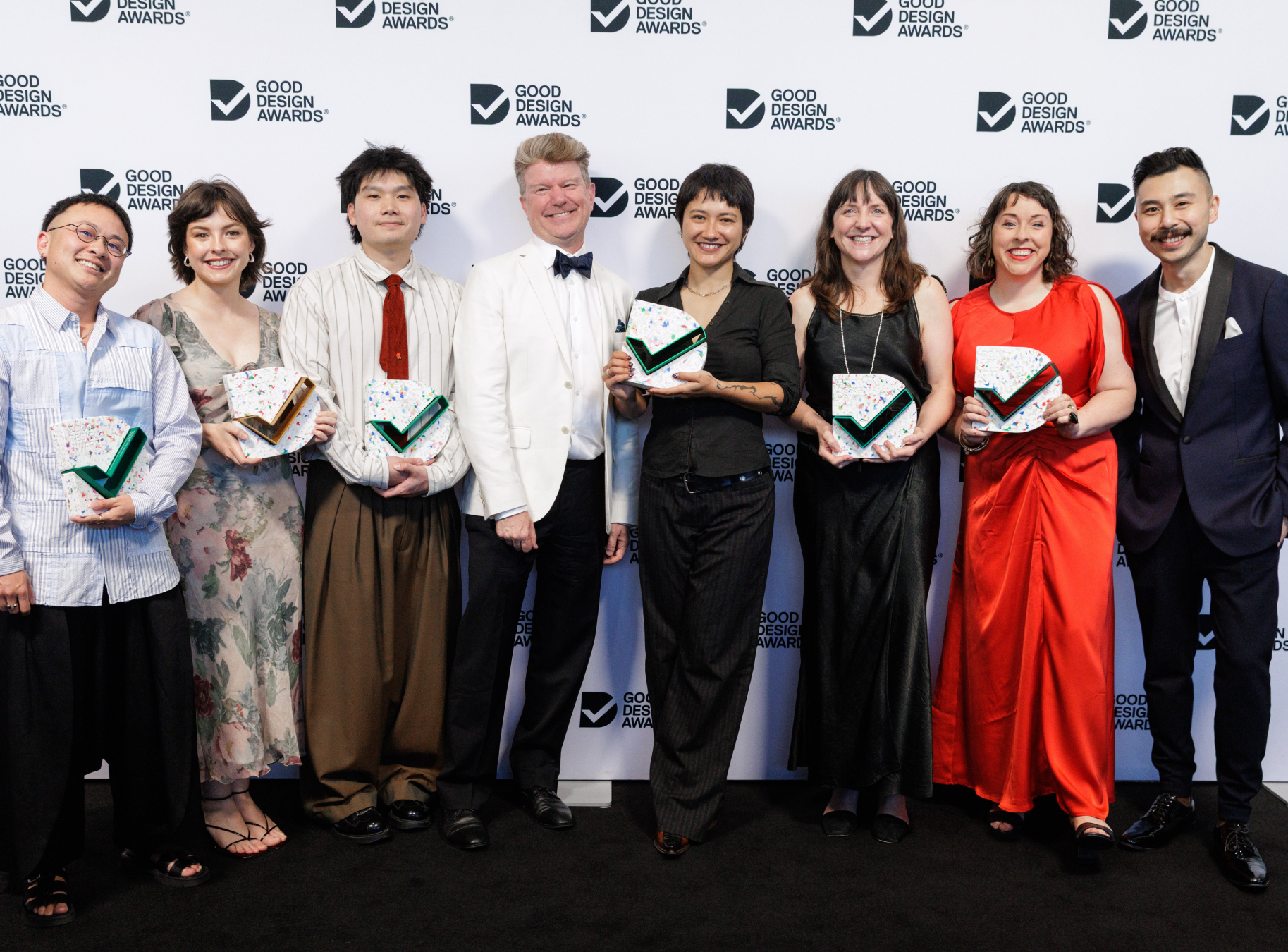
Today was awarded seven 2026 Good Design Awards. This marks our 52nd Good Design Award, recognising consistent design excellence in service of meaningful outcomes.
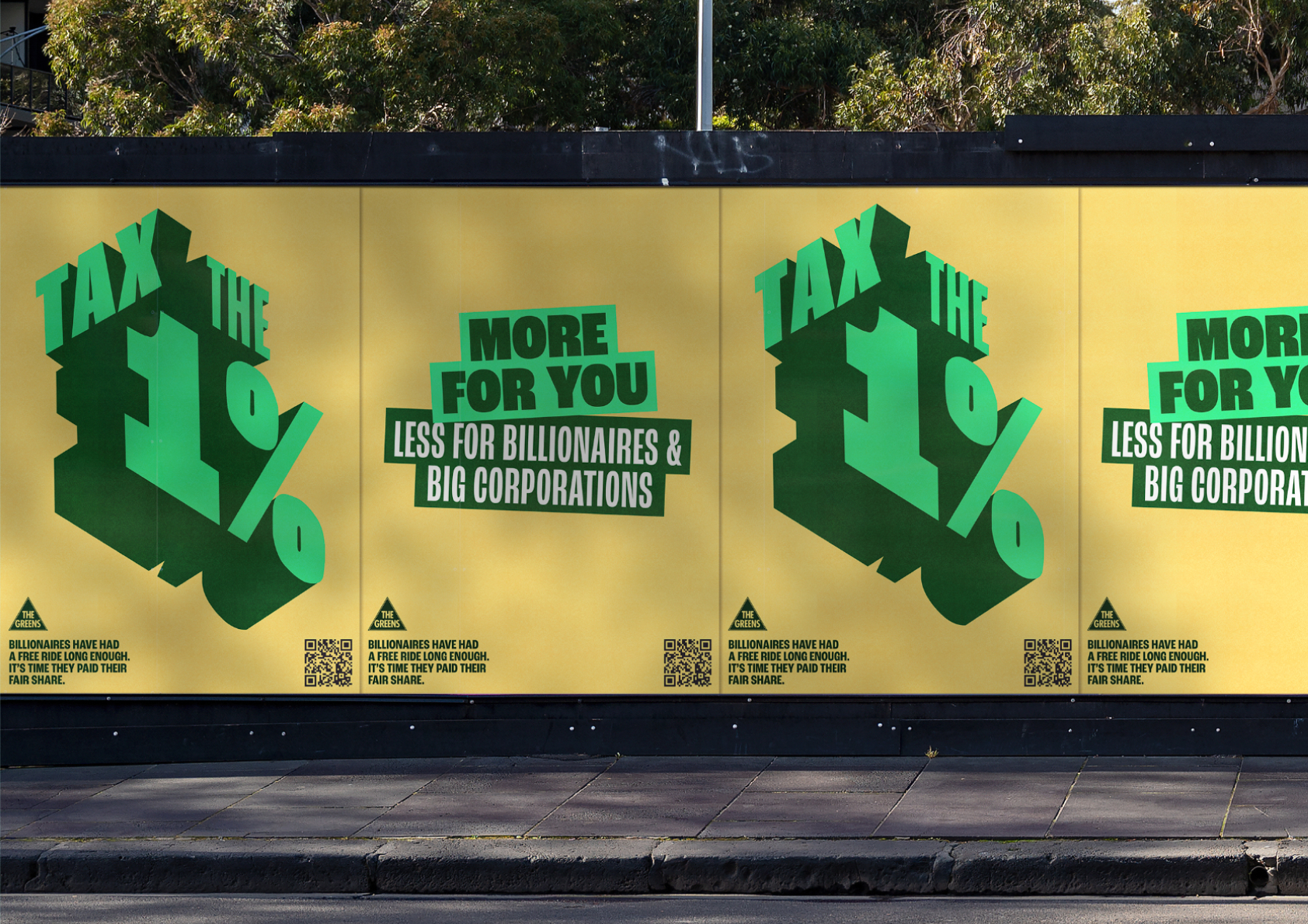
The Greens – Tax the 1%: Turning Australian Inequality into a Personal Story
Gold - Digital, Web Design and Development
Tax the 1% is a campaign microsite for the Australian Greens that turns abstract economic inequality into a personal experience. Through a real-time wealth clock and interactive salary comparison tool, the site helps everyday Australians understand the scale of wealth disparity and take action to address it.
We designed a single-scroll narrative experience that translates a multi-layered policy platform into a personal story. Rather than explaining wealth taxation, the site shows it. Users enter their salary and are shown tailored comparisons: how quickly a billionaire earns their annual wage, how their tax compares to a gas corporation’s, and how CEO pay dwarfs their hourly rate. Each comparison uses real data and culturally specific references (Gina Rinehart’s yacht, Coles chip packets) to make abstract policy tangible. A persistent real-time wealth clock reinforces the accumulation happening as they read. The experience culminates in four distinct calls to action.
Launched in mid-April 2026, the site achieved 20,627 page views in its first two weeks, ranking second across all ten domains in the Greens’ digital network. It outperformed every state contact site, the federal MPs portal, and the membership and donations platform. More significantly, the average dwell time was 4 minutes 21 seconds, well above the 45-second to 2-minute industry benchmark for advocacy and campaign landing pages. Reach and depth together are notoriously difficult to achieve in digital advocacy. This site delivered both, converting attention into sign-ups, volunteer commitments and sticker pack requests.
Nike – Shaping Streetwear Culture with Gen Z
Gold - Digital, Web Design and Development
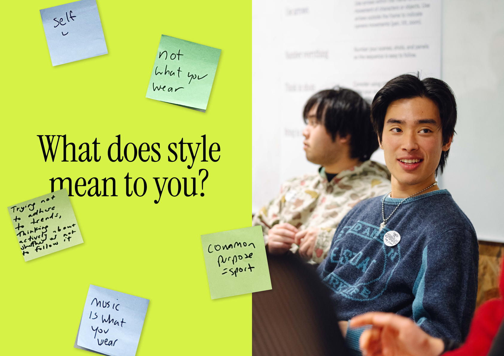
Gen Z creators are shaping culture, but they rarely have a seat at the table with the brands that profit from it. Nike wanted to change that. Through a mixed-method, co-research approach, 16 young Australians became storytellers, ethnographers and designers, forecasting the future of culture and streetwear.
Nike is a global brand navigating a fragmented local landscape, where cultural influence is no longer driven by megastars, but distributed across hundreds of micro-communities and emerging creators. To remain relevant in Australian streetwear, Nike needed deep, reciprocal relationships with the young people actually shaping culture in this hyperlocal context. Our challenge was to go beyond traditional consumer research - which extracts insight without giving anything back - using design methods that genuinely involve young people as co-researchers. We wanted to hear how their communities shape culture, Nike's place within it, and surface strategic implications across partnerships, products, stores and platforms.
We partnered with 16 emerging creators across Melbourne and Sydney—at the intersection of fashion, art, sport and music—and upskilled them to be researchers in their own communities. Each participant received an ethnographic kit: a camcorder and field guide to document their lives over two weeks, generating 250+ qualitative video diaries. Insights were synthesised through collective sense-making workshops, where participants ideated directly with Nike on how to build stronger community relationships. The process was co-produced: from research design (shaped by a creator with over one million TikTok views) to the final hypereel, with an original track by one of the participants.
This research fundamentally shifted how Nike approaches community engagement in Australia. By centering young people as researchers and storytellers rather than subjects, it produced richer, more actionable insight than traditional focus groups could deliver. The 16 participants gained design research skills and a global platform. Nike gained an authentic window into the micro-communities shaping local culture. The project outcomes gave emerging creators a direct route to a global brand audience, modelling a new standard for how commercial research can create genuine, reciprocal value.
Inclusive by Design: LGBTIQA+ Spaces for NSW Public Hospitals
NSW public hospitals are not designed with LGBTIQA+ communities in mind. In partnership with NSW Health Infrastructure, Today co-designed a handbook, including a future vision, principles, and spatial design requirements across five archetypal healthcare spaces to guide how the built environment can support LGBTIQA+ health outcomes.
LGBTIQA+ people, particularly those who are transgender and gender diverse, arrive at public hospitals already managing heightened risk, then encounter spaces that compound it. Fixed seating removes choice. Amenities fail to affirm identity. Wayfinding offers no indication of inclusive services. Sensory conditions accelerate distress. For many participants, these conditions were enough to delay or avoid care altogether. Service-level improvements to LGBTIQA+ healthcare were underway across NSW, but the built environment had not been part of the conversation. No community evidence base existed connecting spatial design to LGBTIQA+ health outcomes. This project was commissioned to fill that gap.
Led by a lived experience designer, the project combined a comprehensive literature review—grounding the work in global best practice and a clear hypothesis about inclusive healthcare spaces—with co-design workshops with deeply intersectional LGBTIQA+ community members. Using futures thinking and generative making, the team reimagined healthcare facilities as dignified and restorative, centring design around what's possible over current pain points. The result: a handbook containing a shared vision, three design principles, and spatial design requirements across five archetypal healthcare spaces, delivered to NSW Health Infrastructure as a provocation of what inclusive design could be across healthcare facilities statewide.
Healthcare facilities are among the hardest built environments to change — governed by strict clinical standards, long capital cycles, and complex institutional decision-making. The NSW Health Steering Committee described this work as delivering “provocative, tangible actions.” Today's design strategy is a deliberate first step in that longer arc: a foundational strategy translating lived experience into future-state spatial design requirements, structured to one day inform infrastructure at scale. Systemic change of this kind takes decades — the fight for inclusive bathrooms alone has spanned generations — but the signals are emerging. This project builds the foundation for what comes next.
Mastercard Inclusion Hub – Designing Hospitality Alongside Autistic Australians and People with Sensory Differences
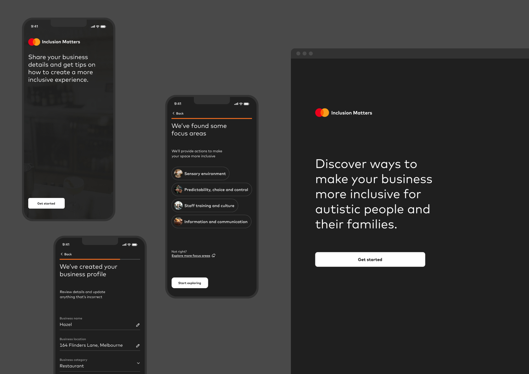
Mastercard Inclusion Hub is a practical toolkit helping businesses create more welcoming spaces for autistic Australians and people with sensory differences.
This project exists because of Mastercard’s vision and commitment to inclusion by design. The challenge was to create something that goes beyond what’s already available and to provide clear direction for meaningfully engaging with the autistic community. One in 40 Australians identify as autistic, yet many everyday spaces remain inaccessible to them. This project is about changing that through action, not awareness. Today led the digital experience design and build, working in close partnership with Autism CRC and guided by Mastercard’s Asia Pacific marketing and communications team, led by Julie Nestor, who championed this work every step of the way.
The Hub is designed as a fast, no-nonsense reference tool. The interface gets out of the way, allowing hospitality owners to quickly identify and save measures that are right-sized and high-impact for their context—whether that's quiet hours, staff training, or Sensory Notes. Sensory Notes is a new menu framework that describes dishes in sensory detail—unpacking the appearance, preparation, arrangement and taste, rather than simply listing ingredients. Unlike traditional menus, it gives autistic people and those with sensory sensitivities the information they need to dine with confidence.
Sensory Notes was piloted at the Australian Open’s Wonder Pies and Peach Melbourne venues, as well as The Mulberry Group’s Hazel Melbourne. Kerry Tavrou, Head of Inclusion & Diversity at Tennis Australia, said: “We’re committed to making the Australian Open the benchmark of sporting inclusivity. By featuring Sensory Notes on our Accessible page, introducing QR signage at Wonder Pies and Peach Melbourne, and promoting them within the BallPark sensory room, we’re giving neurodiverse fans the tools they need to feel informed and supported throughout their AO experience.”
Word on the Sheets – LGBTQ+ Sexual Health, by and for the Community
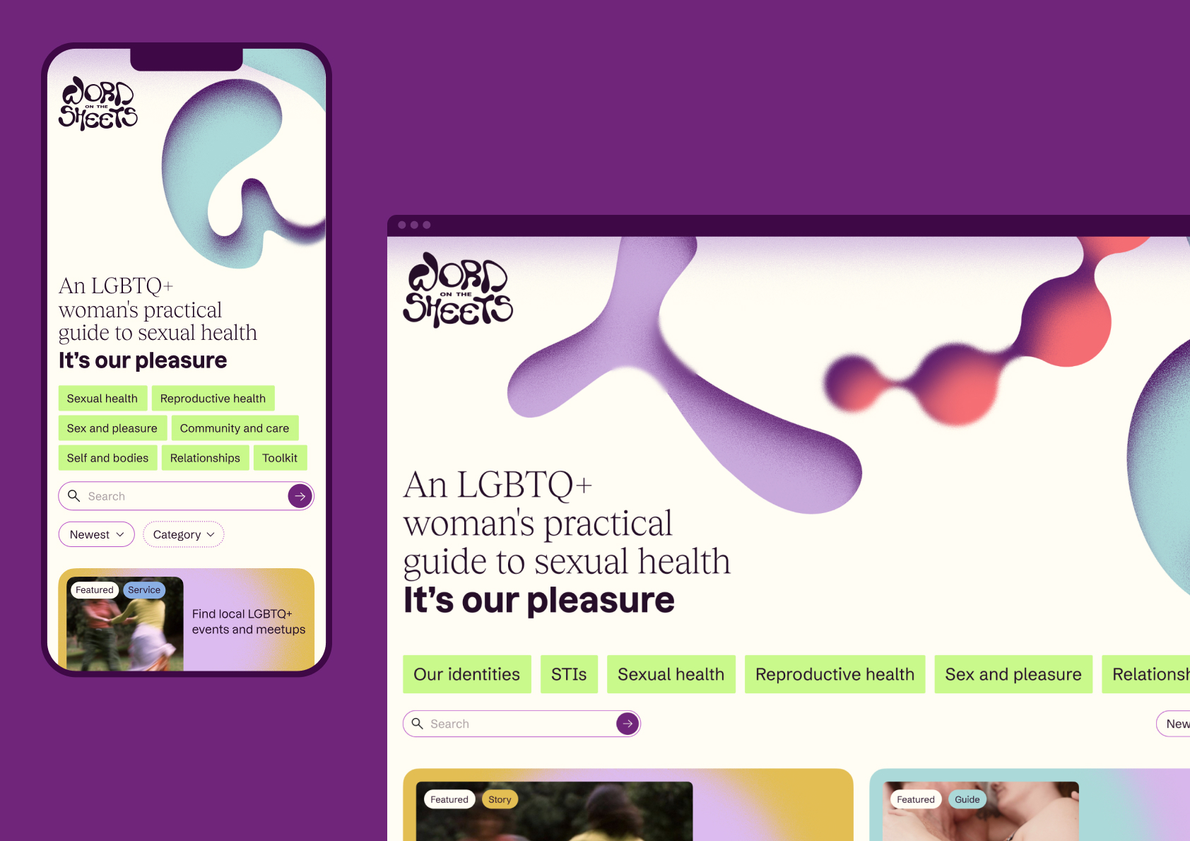
Inclusive sexual and reproductive health information, stories, and services—created by and for LGBTQ+ communities. Word on the Sheets is a first-of-its-kind Australian resource, built with the people it serves, to address a gap that mainstream health design has long left unfilled. It’s our pleasure.
LGBTQ+ women, trans and gender-diverse and their partners have long navigated a healthcare system built around heteronormative assumptions. Mainstream sexual and reproductive health resources rarely speak to queer experiences, and when they do, it's often as an afterthought.ACON, one of Australia's leading LGBTQ+ health organisations, wanted to change that by creating an online resource built specifically for these communities. The challenge wasn't simply to fill a content gap. It was to build something with enough cultural credibility, rigour, and genuine warmth that the community it was designed for would actually trust it, use it, and feel reflected in it.
The name and logo were the foundation of our collaborative exploration: Word on the Sheets. They set the register for everything that followed: warm, knowing, slightly subversive, and unmistakably of this community. From there, a complete visual and content system took shape: key messages to guide content and tone, a palette that balances depth, lightness and vibrancy, a bespoke illustration language that plays with community objects, and an information architecture organised across seven content categories and four colour-coded content types. Each decision reinforced the same intent—to make a resource that felt made by, not made for.
Word on the Sheets is the first dedicated sexual and reproductive health resource of its kind in so-called Australia, created by and for LGBTQ+ women, trans and gender-diverse people and their partners. It won't be complete or perfect from day one. That's by design: the platform is built to evolve, with community feedback actively shaping what it covers and how it communicates. Health professionals and community members review content together. Over time, the resource is intended to grow with and alongside the communities it serves, responding to needs as they change, not as they were imagined at launch.
SEED - Sharing and Enabling Environmental Data in NSW
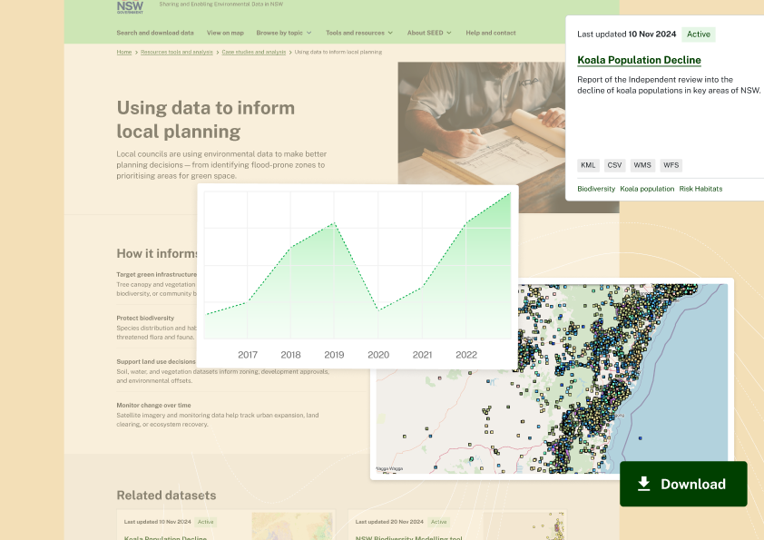
SEED is the NSW Government’s central platform for Sharing and Enabling Environmental Data. It brings more than 6,800 trusted datasets from across government into one place, and through a major redesign, makes them genuinely usable for scientists, policymakers, councils and curious citizens alike.
Environmental data shapes decisions about land, water, fire and climate. But in NSW, it lived across dozens of agencies, in dozens of formats, behind dozens of logins. SEED, launched in 2016, brought it together. By 2024, it held over 5,500 datasets, yet published open data is not the same as used data. Experts rated the ease of finding information at 3.19 out of 5. Non-experts rated it 2.64. The challenge was to redesign SEED so a GIS analyst, a council planner and a community member could all use it, without dumbing down the science or overwhelming a newcomer.
SEED was redesigned around three shifts. From static to timely: the new site signposts dataset freshness, links articles to contextualise impact, and surfaces topical data on a dynamic homepage.From dense and technical to accessible and digestible: plain-language titles, topic-based navigation and a simplified menu enhance expert-led “Hubs,” helping new and power-users alike find what they need quickly.From business-led to impact-centred: instead of organising data around internal terms and tools, content is structured around the ‘why’, with case studies and use cases that reflect the interests of NSW’s diverse communities.
SEED’s redesign makes environmental data easier to find, understand and apply, for GIS analysts building constraint maps for planning reports, and community advocates building cases to protect their local environment. One koala-conservation NGO uses SEED weekly, layering sightings, habitat maps and threatened species records to challenge proposed developments. The redesign lays the foundation for SEED’s strategic future. Guided topic pages and self-serve search let audiences discover content their way. Visible impact on every dataset gives real-world context. SEED aligns with NSW Government open data priorities, contributing to better environmental outcomes and more accountable public decisions for the people of NSW.