Championing Australia’s LGBTQIA+ youth via a new digital platform.
In partnership with Minus18
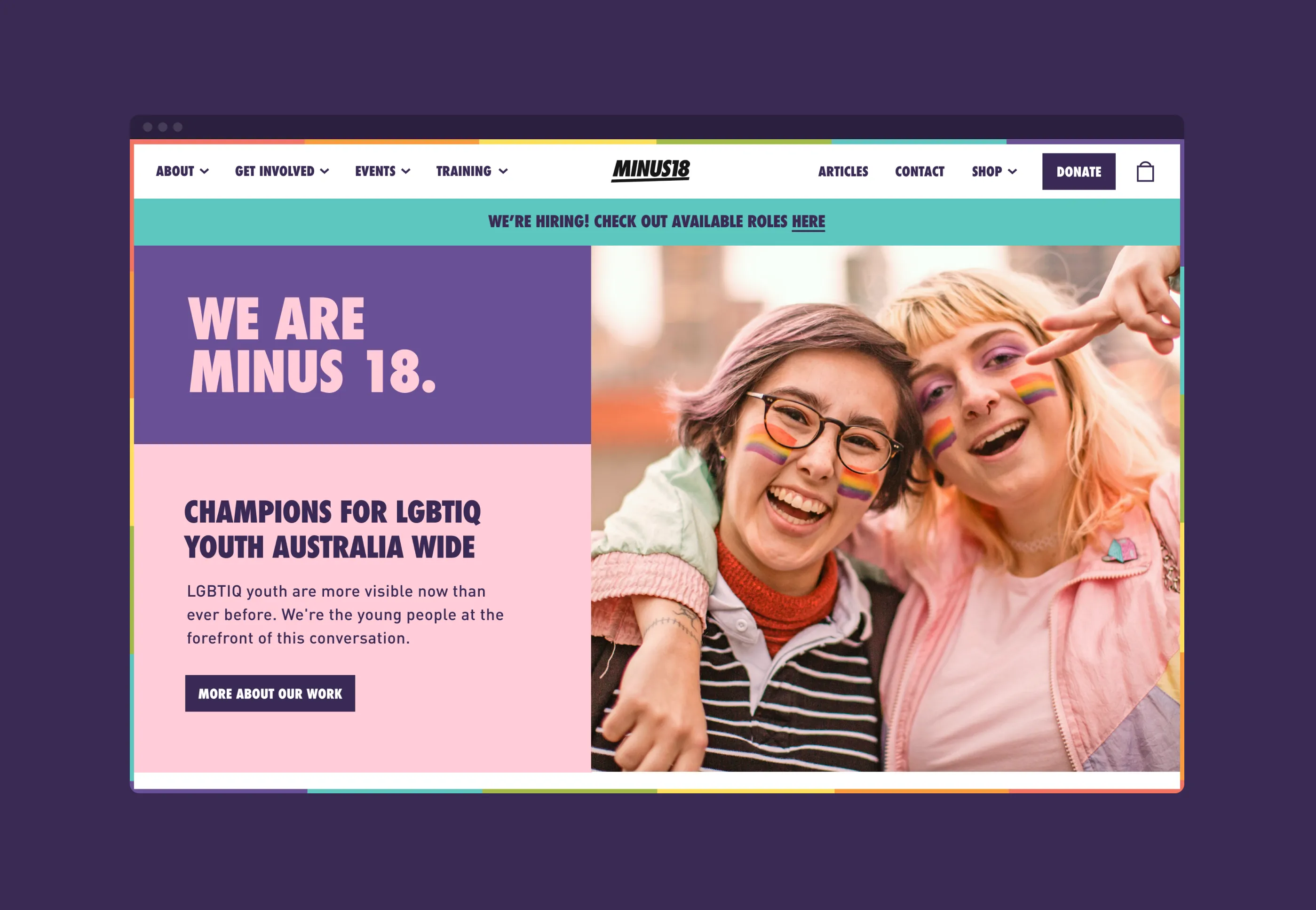
Yesterday
It remains extremely challenging to be a young LGBTQIA+ person today.
Early experiences of gender and sexual identity are full of challenges like fractured support systems, a lack of appropriate sex education and a lack of safe spaces.
Minus18 has been working hard to address this for over 20 years and has become a critical support for LGBTQIA+ youth across Australia.
Experiencing rapid growth, Minus18 found their website inadequate, with a user experience that had become bloated, complex, and inefficient to manage.

Today
Working with the client team, we mapped Minus18's key audience groups:
- Young people looking for support, guidance and community connection.
- Businesses, corporate sponsors and partners.
An object modelling workshop helped to prioritise content hierarchy based on the existing website—breaking down each page and messaging component. One outcome was identifying an opportunity for a consistent narrative to encourage sponsors, donors, parents, and schools to get involved.
We worked with Minus 18 to identify pains and potential gains in website management. Our solution architecture prioritised improving the online store, streamlining the booking flow and improving subscriber management.
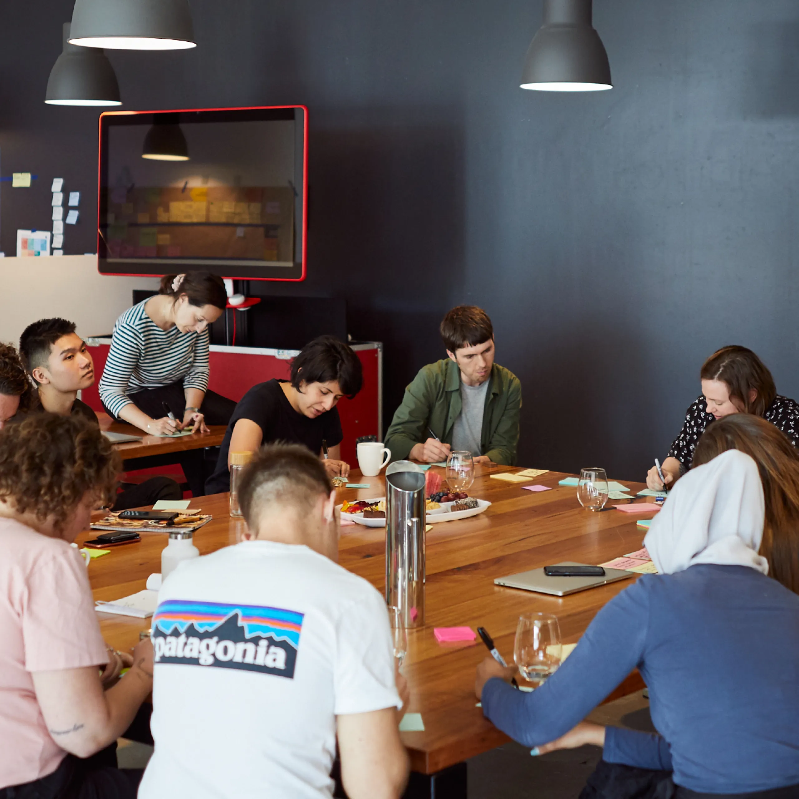
Minus18's existing brand is eye-catching, bold and captures the diversity of LGBTQIA youth wonderfully. Their brand guidelines were developed mainly for marketing comms without specific digital consideration and served as a great starting point. We adapted the existing brand to ensure the execution was appropriate for both the youth and corporate audiences of the website. We collaborated heavily with the Minus18 team to strike the right look and feel for the brand's first large-scale digital execution and the end result is bang-on!
Leo Beganov, Senior Product Designer at Today
Tomorrow
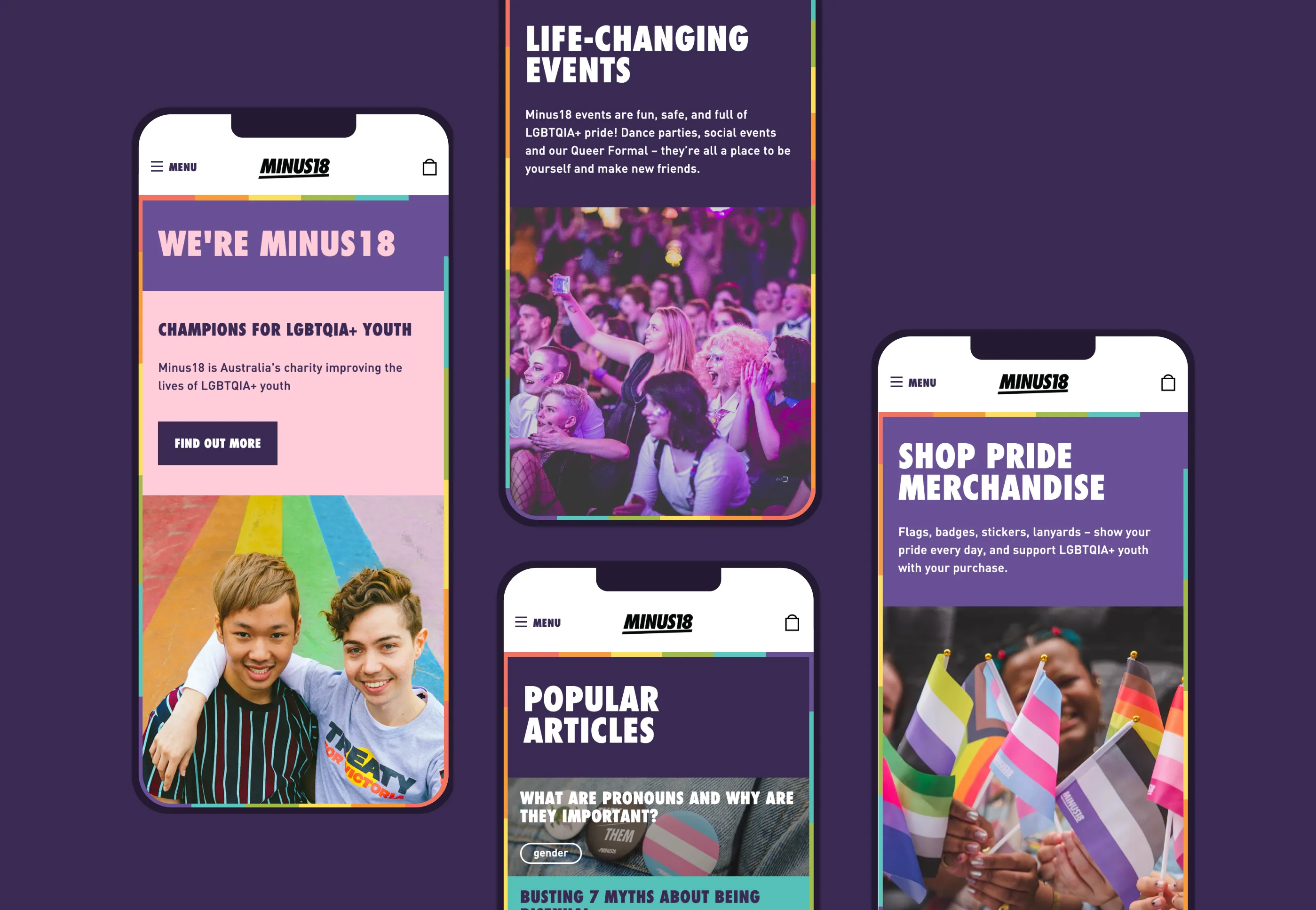
The website design honours Minus 18's youthful, queer brand personality while reflecting a mature, professional organisation. The interface uses a component architecture, allowing modules to be reused and recomposed across the site.
An optimised store experience decreased the cart abandonment rate in peak periods such as the lead-up to IDAHOBIT each May.
A better authoring and management experience means that site maintenance requires much less time and energy. By leveraging existing services and integrating them in a new cloud-based environment, we've established a platform that has proven easy to scale and extend as needs continue to evolve.
Importantly the new experience we co-designed with the community has become an impactful platform for Minus18, strengthening the org and enabling them to support more and more LGBTQIA+ youth.
You can find the Minus18 website here.


Get in touch
Want to know more about inclusive website design? Chat to Steph today.
Steph Little
Senior Partnerships Director
Next Case Study
In partnership with RMIT University and YLab:
Preventing economic abuse in young adult relationships
